BY Steve Kirsch Founder, Vaccine Safety Research Foundation (vacsafety.org) Updated 1/31/23

If the CDC was honest, this is what their new ads should look like!
Using a novel analysis technique, anyone can now prove that there is no longer any doubt that the vaccines are SHORTENING the lifespans of EVERYONE who takes them. They should be immediately stopped.
Update at 12pm PST 1/31/23
This critique is convincing, but wrong. If everyone was last vaccinated just 10 days before the end of 2022, it would still be a .5 ratio if the vaccines were perfectly safe because the death rate in the final 10 days would be spread evenly over time.
I realized I made an error in some of the formulas so I’m re-doing the numbers.
Also, because the unvaxxed transition to the vaccinated, there are fewer unvaccinated to die in later months so there will be fewer unvaccinated deaths which will skew the ratio for the vaccinated to be lower than .5.
I’m currently using the date of last vaccination as the starting point and I believe it may be more correct to use the date of first vaccination. Still mulling that over.
Executive summary
This is the most important article I have ever written in my life.
It shows a novel method that anyone can use to prove that the COVID vaccines are leading to premature death in anyone who takes them, no matter what age. So you don’t have to believe me. You can collect the data yourself and do the same analysis I did. It’s very easy. It took me about an hour to collect the data and analyze it.
The methodology is both technically sound and objective. Anyone can collect their own data including any state in the US and many foreign governments. I predict no one will look. That tells you everything you need to know.
I asked UK Professor Norman Fenton to critique the method I used here. More about him in the text below. Bottom line: he loved the method I used (which he hadn’t seen before), he validated the calculations in the figure below, and he wasn’t aware of any way the conclusion could be legitimately challenged. There are always all sorts of hand-waving arguments such as “your study wasn’t IRB approved” or “your study is unethical because you are looking at deaths from the COVID vaccine” but they are just that: hand-waving.
To further prove my article cannot be challenged, I am pioneering a unique approach to that as well that is fair, thorough, and transparent. I’m publicly offering 10X your wager to anyone who believes that the data actually shows the opposite of what I claimed. See details of the offer in the text below. If you think I got it wrong, you can turn $25K into $250K in days!
This article describes how a simple objective analysis of objective death data (age, date died, date of last COVID vaccination) can be used to prove beyond a reasonable doubt that the COVID vaccines are shortening lifespans and should be immediately halted.
This explains why all the world’s health authorities are keeping their data secret; their data would reveal that all world governments have been killing millions of people worldwide. No government wants that disclosed. They won’t debate me on this. They will try to censor this article because they can’t hide from the truth. Or they will try to create FUD by arguing the survey is biased without describing the bias.
I predict that this article will be ignored by the mainstream press and the medical community. The longer they ignore me, the worse it will look for them. The first rule of holes is that when you find yourself in a hole, stop digging.
Unless there is a serious error in my methodology or someone can explain precisely how surveying “my followers” creates a biased sample that shifts the numbers for the vaccinated or shows us a more comprehensive, trustable data set, the game is now over.
If the vaccines are safe, the CDC should have produced this analysis using statewide data long ago. It is trivial to do. Why didn’t they? The answer is simple: because they know it would blow the narrative and prove to the world that they are incompetent fools.
If you want to prove me wrong, let’s get the statewide data from all states and make it public. All we need is Age, date of death, date of last COVID vaccine. That does not violate HIPAA or a dead person’s privacy because there is no PII.
But states will refuse to release that data because they know if they did, they are finished.
So in the meantime, they will say, “Your survey is biased.” But nobody can explain the “bias” that explains the result because my readers DO NOT CONTROL THE DATE THAT THEIR FRIENDS WERE VACCINATED, their age, or the DATE they died.
My readers may be more affluent than the average American so that’s a bias. But if the vaccine is killing affluent people, we have a problem. My readers might be more intelligent than the average American, so that’s a bias. They may have more intelligent friends. So this survey, it could be argued, just shows that intelligent people are being killed by the vaccine. That SHOULD be a stopping condition.
Or you could argue that my readers are less intelligent than the average person. And once again, unless you are trying to cull a society, that should be a stopping condition as unethical.
ANYONE CAN REPLICATE MY SURVEY if you think it is “biased.” The New York Times could replicate my survey and prove I’m wrong.
But they won’t.
And that tells you everything you need to know, doesn’t it?
If they want to argue with this article, THEY need to show us THEIR data and not engage in hand-waving arguments to create FUD that have no evidentiary basis.
The game is over. We have won. You cannot hide from the truth any longer.
We’ll see if anyone wants to challenge this article and get paid 10X their wager if they are right. Bring it on!
Introduction
This article is a follow up on my article entitled, “The death records show the COVID vaccines are shortening lifespan worldwide.” That article gives John Beaudoin credit for being the first to realize that linking the death and vaccination records (a table join) is key to ending the false narrative.
In this article, I show a clever new method for analyzing the death/vax records that is simple and objective; it relies on just a simple division of two time measurements.
The survey
A month ago, on December 25, 2022, I announced the survey below.
The survey asked people if they knew anyone who died in 2020, 2021, or 2022.
If they did know someone, simply report objective facts about the death: age, date died, and if vaccinated, the date most recently vaccinated.
If people knew >1 person who died in the period, just report the person whose details you are most familiar with (e.g., family member vs. friend).
As of January 29, 2023, I received 1,634 responses. The analysis here looks at the responses.
We only consider OBJECTIVE data and our analysis is OBJECTIVE. It’s all math.
If the vaccines are causing death, the analysis will pick it up.

Methodology
The analysis is done by looking at “days in category before death” divided by “days possible in category if you had lived to the end of the observation period.”
We do this for both vaxxed and unvaxxed people… across all ages, and also in various age ranges which I arbitrarily chose. You can choose your own if you don’t like the age categories I chose. It won’t change the result.
Here’s how the method works (credit to Clare Craig who suggested this wording):
Imagine a timeline for 2021 and 2022. For the unvaccinated we would expect an even distribution of deaths over time except for seasonal differences. For each person, we can compare how long they did live in that period with how long they could have lived. A few who died early would have lived for only a tiny fraction of their potential and a few that died late for a large fraction. However, most will be in between and the mean will be 0.5.
For the vaccinated, we start the clock on their date of their last vaccine. The timeline will therefore vary for each person but with a harmless vaccine we would still expect exactly the same distribution – a few early, a few late and most in the middle with a mean of 0.5.
If the vaccine killed people we would end up with more deaths early on. The mean ratio of life lived compared with life that could have been lived will fall below .5.
Given ratio=((time in category)/(time possible in category)) and knowing that the person died sometime in Jan 2021-Dec 2022, we have:
- If the intervention (i.e., the vax) does nothing, ratio = .5
- If the invention shortens life, ratio <.5
- If the intervention increases lifespan, ratio > .5
It’s that simple. The important thing is that the ratio tells us if the intervention is helpful, neutral, or harmful.
The analysis is independent of the rates people die. The fact that older people die faster than younger people is immaterial. Pre-existing conditions, etc. do not matter.
There is an argument to be made that people who got vaccinated first were more vulnerable and were more likely to die, and thus the rate in a category changes over time, but that effect isn’t very large. I’ve run the numbers for those who died and were last vaccinated in 2022 and the numbers are all less than .5. You are welcome to prove me wrong, but you’ll need to do it with evidence, i.e., actual queries and not hand-waving arguments. Numbers talk.
To date, everyone who thinks they can debunk this has produced only handwaving arguments and no analysis.
Sorry, but that’s not very convincing.
Limitations
My survey includes reporters from all over the world, but all the readers speak English and 70% are in the US. The data can be analyzed just for the US and for specific vaccines as well, but below I include all the records to show that I’m not cherry picking and also to get more stability in the numbers (fewer data points creates more noise).
The people who answered are my followers and are most unvaccinated themselves. They are reporting deaths of the person they know the best, whether vaxxed or unvaxxed. I invite fact checkers to validate that people were true to the direction they were given. There are more vaccinated deaths reported simply because 75% of the US population is vaccinated.
The percentage of unvaccinated to total deaths was 29% (222/(222+542)).
So you might think “Ah ha! That proves that the unvaxxed are dying at a higher rate than the vaxxed because it should be only 25% of the deaths that should be vaccinated so this PROVES the vaccines are saving lives!”
No, it just proves that unvaccinated people hang around other unvaxxed people and are slightly more likely to report their deaths.
This is very helpful for our survey for two big reasons:
- It gives us enough data in both the vaxxed and unvaxxed buckets so we can do meaningful comparisons between the two buckets
- I can’t be accused of bias, e.g., you anti-vaxxers are just reporting vaccinated deaths to make the vax look bad. Clearly this isn’t the case… they are reporting disproportionately more unvaccinated deaths. So it looks very credible because it’s consistent with what you expect to see.
Note that the mix of vaxxed/unvaxxed deaths is immaterial to this analysis. Each cohort is examined independently. If I had 50% vaxxed and 50% unvaxxed deaths, the results would be exactly the same.
It’s important to note that my followers cannot determine the date of death of unvaccinated or vaccinated individuals (unless they have God-like powers). And I have contact info for all the records so they can be “spot checked” to validate that people followed my instructions to report the person they are most familiar with.
There is a recall bias in that people are more likely to report deaths that happened more recently. This shifts the average death time to the right. This is why unvaxxed are > .5 (more about that later).
For vaccinated people, there is also a healthy patient bias. If you are going to die in days due to a fatal cancer, most people would not get vaccinated.
There is some amount of seasonality in deaths that might skew things somewhat. It’s minimal for those <60, and small for the elderly. But we’re looking at a 2 year period so it shouldn’t be much different between vaxxed and unvaxxed.
Gaming
It wasn’t possible to game the survey because nobody, including myself, knew how I was going to analyze the data until after the data was collected.
There was one person who put in a bogus entry (record #260) but that was easily spotted and removed.
The analysis cut off time was before this article was written so anyone trying to pollute the data will be unsuccessful since any new records aren’t included in the analysis.
Transparency
The database has been in public view the entire time that the data has been gathered. When a record is submitted, it appears in the public view.
Verifications
No submissions were deleted (other than record 260 which was clearly gamed) or modified which can be verified by the changelog of the data. The database is hosted by a third party firm.
There is an “integrity check” field indicating which records passed simply sanity check such as date vaccinated < date died. Only those records were processed.
I have the contact information for each reporter. I am looking forward to being contacted by any mainstream “fact check” organization who is willing to be recorded on video as we discuss the article. I’m happy to supply contact info for any line(s) in the survey so the fact checker can verify every record is legitimate.
Expectations
People who die within 2021 to 2022 should be expected to die evenly throughout the period (there is some seasonality so it isn’t flat over the calendar months). Therefore, with no biases, we’d expect that the average days of life is 1 year in any 2 year observation period. So a ratio of .5. The seasonality cancels out.
But due to recall bias (since we are asking people to recall deaths rather than using government records), we’d expect the number to be skewed to dying more recently so maybe we’d see a ratio of .55 for the unvaccinated.
The vaccinated benefit from both recall bias and the healthy patient bias, so it might be .58 or more.
If the vaccines are safe and effective, the ratio of the vaccinated > ratio of the unvaccinated due to the healthy patient bias.
If the vaccines are killing people, the ratio of the vaccinated <= ratio of the unvaccinated (since the healthy patient bias would give the vaccinated an advantage).
If the vaccines are killing people, the ratio will be <0.5.
If the vaccines are safe, the ratio will be >0.5.
Guess what we found? 🙂
The results
The data couldn’t be more clear: the shots are killing people.
The ratio for the vaccinated is .31 or less for every age range with > 5 records.
For the unvaccinated, the ratios are .52 or better for every age range with >5 records
The data is remarkably consistent when there are enough records for the range (generally 10 or more records per the uV# or V # columns).
The values in red are unreliable due to a lack of sufficient data points.

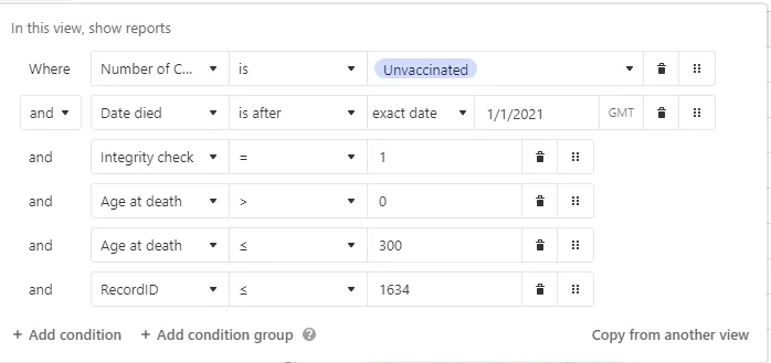
For the unvaccinated, my Airtable filter looked like this and I used the unVaxxed days alive/days possible columns:
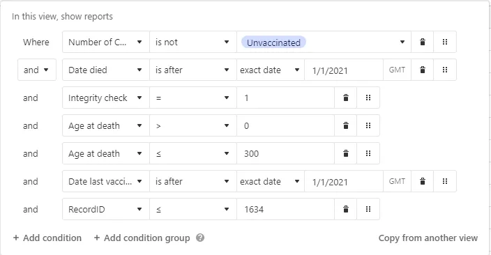
For the vaccinated, my Airtable filter looked like this and I used the Vaxxed days died/days available columns.
NOTE: The “Integrity check” is NOT complete. But when coupled with the restrictions of the two filtering conditions, invalid records are all filtered out of the final result.
inal result.
Is my analysis wrong?
This is an Occam’s razor analysis. You could get fancier but it wouldn’t change the result. The signal is very very strong that the vaccines should be immediately stopped.
If I have made a mistake, I’d be grateful to see the correct analysis of the data using the same methodology. So if you object, show us the proper analysis.
The data is remarkably consistent for each age range. But there is a huge difference between the vaxxed (.3) and the unvaxxed (.58). This is exactly what I expected to see; no surprises. But it’s IMPOSSIBLE for the blue-pilled medical community to explain how this could possibly happen if the vaccine is so safe since it was supposed to be the other way around.
A simple look at the Notes field confirms the role of the vaccine in these deaths. That’s subjective proof. It shows that the vaccines are not as safe as claimed.
As far as confidence intervals, the numbers are remarkably consistent so the confidence intervals appear to be small. I’ve asked Professor Fenton for the correct way to ascertain these. He’s thinking about it. I’ll update this when I hear back.
But there’s more confirmation…
Failure anecdotes » success anecdotes
Is this analysis consistent with reliable evidence? Yes.
It turns out for the COVID vaccines, the best evidence we have is anecdotal evidence where everything is tracked since government data can be badly wrong as we learned in the UK where mistakes led them into thinking the vaccines were safe (see UK ONS admits their data is flawed; the vaccines may not be beneficial after all. Sorry about that).
As it turns out, it’s easy to find failure anecdotes for the COVID vaccines. The anecdotes we generally find show STRONG failures.
By contrast, it is nearly impossible to find a “success anecdote,” even a weak success. I always ask doctors who will talk to me and they’ve never mentioned a single success story. I do this constantly on Twitter Spaces in full public view and NONE of the DOCTORS will EVER be able to cite an example. In fact, I have not found any medical doctor who has ever been able to cite a single geriatric practice or nursing home where deaths dropped after the vaccines rolled out.
If the vaccines were saving lives, there should be THOUSANDS of “poster elderly” success stories, yet there are none. All the anecdotes are strongly negative. That’s simply impossible if the vaccines are saving “tens of millions of lives” as Neil deGrasse Tyson said on YouTube. When I called Neil to ask him for a success anecdote, he hung up the phone on me.
So we have a pretty good sense just from the failure to find a success that the vaccines are an utter disaster. We didn’t even need to do any numerical calculations!
Lots of things confirm our hypothesis:
- Lack of success anecdotes, but failure anecdotes easy to find
- People switch from pro- to anti- but not the reverse.
- Nobody can explain the 15,000 excess deaths in VAERS for the COVID vaccines. It’s not there for other vaccines, the deaths are all consistent with vaccine deaths. What killed all these people if it wasn’t the vaccine?
- Ed Dowd’s book “Cause Unknown” contains tons of data. Where is the document debunking everything in that book and showing the cause of all these deaths, especially the increase in child deaths happening right after the vaccines rolled out for kids.
- What about the 770 safety signals in VAERS. Why didn’t the CDC tell anyone about any of those signals? They notified the public about the VSD signal for stroke and didn’t even mention that it also triggered in VAERS.
- MIT Professor Retsef Levi calls for a halt to the COVID mRNA vaccines based on his study and others.
- The vaccine isn’t as effective as the NEJM led you to believe. A key paper is deeply flawed. In fact, it shows very troubling data as people will soon see: that the vaccine makes .

- Large Cleveland Clinic study shows the more you vaccinate yourself, the greater the risk of getting COVID. Whoops!
- A New Zealand funeral director noticed 95% of his cases died within 14 days of the shot. I spoke directly with Brenton. He lives in the middle of a retirement community. This is the very age that is supposed to be protected by the shots. Average age is 70+. His records can be verified. Any takers?
- Embalmer Anna Foster found that 93% of her cases had telltale rubbery clots. How can anyone explain that? She is hardly alone… 80% of embalmers surveyed report seeing these new style blood clots; they have never been seen before the COVID vaccines rolled out.
- Southwest airlines: Pilot deaths have increased 5X after the vaccines rolled out and disability shot up by 10X normal. Pilots are among the healthiest people on the planet.
- Geriatric practice: I finally found a large geriatric practice of 1,000 patients, 75% are over 65. Their normal death rate is 11 per year (the mean). In 2022, they had 39 deaths for the entire year. They attribute the 28 excess deaths to the vaccine. If it wasn’t the vaccine, someone needs to explain to us what is killing these people because whatever it is, it needs to be IMMEDIATELY stopped. They can’t go public for fear of retribution.
- Savo Island Cooperative (Berkeley, CA): Roughly 150 people. No deaths for 5 years before COVID; 0 in 2020; 1 in 2021; 3 in 2022 and they were all vaccinated and boosted (plus 3 strokes and 4 heart attacks). Reported to me by Jane Stillwater last night at an event I spoke at. Nobody at the event could recall any success anecdotes.
- Ed Dowd mentioned the vaccines have killed 800K Americans and disabled 4X as many as killed, 3.2M since the vaccine program began.
- The peer-reviewed scientific literature published a paper by Mark Skidmore showing over 217,000 deaths in 2021 alone due to the COVID vaccine. But they are looking at retracting the paper because Mark didn’t include a full bio on one of the funders of the study. Also, he asked a question about deaths from the COVID vaccine and that’s unethical (COVID virus questions are OK and ethical).
Josh Stirling looked at how cities in the US did in 2022 vs. 2021. So it’s a longitudinal study where you compare the city with itself one year ago. This is the best way to see what is going on… did your mortality increase or decrease. Check this out: cities with higher vaccination had larger all-cause mortality increases than cities with lower vaccination rates. In other words, the line goes the “wrong way.” This is devastating for the narrative, but of course consistent with what the death reports are saying. The R2 doesn’t need to be .9 for this to be convincing. They are correlated and it’s the slope of the line that is significant. The slope is the wrong way. That’s the point.


 See full article HERE
NOTE: The summary and challenge to prove Steve Kirsh’s analysis wrong is at least as long as what is above. As of the 1/31 update, an error had been discovered and he is re-working against the same data. But he is still challenging Big Pharma and their deep state partners to prove his conclusions wrong and show how they got THEIR numbers.
